Zayda Lopez HW for December 10th

Team: Chris, Pete, Zayda
Project Title: Expressionist
Summary: Photographs are turned to black and white and are exchanged and painted on to express an emotion we are feeling at that time.

Aesthetic Summary: painted black and white photographs.

Art :Photos

Copy: the definition of Expressionist
Color Scheme:
Typefaces: Times
Layout Notes: 1″ margins

Size: 8×10

Pages: 58
Cover type: hardcover – image wrap
Binding: perfect
Paper finish: matte
Paper weight: 100 #
Paper brightness:
Bleed:0.25″
Printing Facility: Blurb
Set up costs:
Proof costs:
Total quantity: 4
Total cost: US $168.36
Cost per unit: $42.09


Melissa Kaynas May 19th HWK

My Groups final project was not perfect it was a challenge and it was certainly ambitious. However we all enjoyed and and we learned from the experience. aside from the small cutting mess ups our project came together as a sellable product very nicely. it looks almost like a souvenir that you could purchase and display. the colors were spot on all bright and vivid just as we had intended. when the final product had been printed and we had a close look at it we did realize in some cases the alignment was over by such a slight bit which added slight white space to our cards however it didn’t effect the design, nothing important was cut off or hard to read which was a plus. the poster paper is exactly  what we had in mind in terms of the matte silky finish however i wish it had been more heavy weighted like the printing employee had told us. it seemed too flimsy to be a folder but the print quality was no doubt an exceptional likeness to  our files it was on spot. The cards weight was a great paper quality as well although we had wanted linen 310 paper this card paper suited the project well and printed the colors really nice too.


The overall design of our project i am proud of. i love the fact that we came up with this all on our own and produced it as a package and had it ready to go. the designs and fonts everything works so well even our title :KABOOM CARDS, which explains in its own how difficult it was to create a nice piece but we did it.  My group was very understanding and open to any ideas no one was ever shut down for their thoughts or excluded we all worked together making compromises and worked towards the goal even with our sketches editing we all would help each other out. Which was nice because there wasn’t any tension or anger that lingered for too long because we would always resolve it to have a peaceful work flow. The disappointment i have about our project is the cutting. We took  turns making the cuts with the tool which is probably why there wasn’t much consistency in the cutting. i of example am terrible at cutting so i did my own cards. perhaps if we chose one person with patience to cut all the cards and the poster it would have been a clean finish. also as i said our communication at first disappointed me a bit but we resolved it along the way.


I would say that my role in the group was keeping everyone together and on point with due dates and meet ups. i wouldn’t say group leader tho because in a sense we all were leaders at different points in the project process. During this project what worked best was our discussions at the beginning and really getting our ideas out there not being shy or afraid and also our files did come out really nicely and consistent as a deck should. i am most happy with the overall finished project and the way with few modifications and perfecting it can be sold as i said at a barnes and nobles. i am glad our idea was so unique and started from start to finish it made me proud to see it and know that four of us came together and made this finished piece. i am happy with everyones designs and the different suits sections identified by 4 different myths i think this project has so much potential and i am apply we came up with it and executed it to such an extent. Although it may not be perfectly cut our project color wise printing wise and presentation wise was a great learning experience to handle printing processes one on one in person with a printing facility and to sit down as a group to determine the solutions to the problems we had along the way.


Melissa Kaynas May 12th hwk

Image

For the KAboom cards final Project things certainly did not go as expected. When we had thought about the idea of playing cards we thought it would make a cool and interesting portfolio piece. Then we added more what ifs and details like “what if it became a poster too and the cards were perforated to make it an experience when someone would play our cards. We began with so many ideas like first we would design 54 different characters and designs but then we had to re think the time we had and just decided on designing four different suites instead. it was hard to narrow down our characters and to make our drawing styles consistent yet still unique. Design wise we all had so many ideas about our characters everyones sketches were different some with too many details and some with not enough. coming up with the colors consistency  as well was quite the challenge. at first we were going to go with only four colors much like traditional playing cards but then my group and i decided that it would dull the interest of the characters. by making each card character bright bold and smooth colors we added to their identifications and made each suit of  cards a small work of art on its own.

Along the way we had to accept the fact that our cards probably wont be able to be perforated by a printing facility because they would not set up their machines to cut one quantity. we had called up a place in our previous class to do it but they asked too much money from us ($200 to be exact)  because they considered it a custom di-cut job and a rush fee (no way). so we were about to send our cards to be pre done as all playing cards are however that would take away from our projects character and damage the experience. So we decided to go in person to different printing face;ivies and explain face to face our proposal so that we can have a one on one understanding of the way it would be printed and an in person sample of our project to make any adjustments on the spot. in terms of the perforations our idea had hit a rock , so we decide to take a different approach and pitch in money and buy the tool our selves to perforate our project. Which worked nicely because  now we have the overall experience to come along with the package. Our digital final files were perfectly aligned and had the proper color settings and was looking good for the most part however we were nervous about the printing and spoke about  trying several printing facilities since we wanted our cards to be double sided perfectly aligned and perforated. i am expecting all the sizes to be on spot too because we took the time to measure everything and lay it all out the same on every page including the posters. the way i see our project is something that can be sold in barnes and nobles in its owen unique packaging possibly in the older children’s section because it  requires a lot of hands on activity. i see it looking bright and having a smooth cover not a glossy kind of paper more like matte finish or a linen finish.

if i could change anything about the cards i would change the amount of meet up time we had everyone was running on different schedules which meant that we were mostly meeting each other in pairs and then calling each other to talk about what happened. this gave us some cut backs because we would see how different each conversation went and how different the sketches were we really had to work on the communication and work updates. i would like to see out project perfect however nothing happens perfectly the first time and this certainly is an experience where both myself and my teammates are learning to have more patience with our team mates while still staying on top of each other for work progress.  But we made it work to the best of our abilities and i am glad that our idea has made it this far soon to present itself as a brand  and experience to the class and i can’t wait to see the printed piece and see how everyone will react maybe even play a game or two with our cards because it is a complete deck ready to go.

May 19th wing wat

One week before the final presentation I was so afraid that we wouldn’t be able to print our project out as we wanted since the project we had is very rare for the print production. But my teammates were so awesome looking for ways to solve the problem. About the design I’m quite happy with the result.

The only sad part is that the cover wasn’t too perfect…the paper couldn’t stand the folding and broke a little. But for the quality of the paper I would less mind about the fold.

It was a great experience working with my team. And if my teammates weren’t them, I  would never approach such topic like mythology and the result is mind blowing.:)

everyone have a great summer!

Deny Hernandez HW 5/19

Overall I am pleased with how the book came out. Aside from a few minor details like the text on the spine, there isn’t much I would change. I look forward to printing a copy for my portfolio.

As far as the colors, all but a few printed true. The yellow taken from the M&M’s darkened a bit as well as the plates but not to the point of it being overly noticeable.

After talking in class I would like to see it in a larger format to give the text more white space and the highly detailed images more of a chance to be viewed and enjoyed.

Deicy Cordero HW May 19

Overall i think the project came together well. Considering the issues that arose in the uploading process on the card sites the cards came out very close to what we anticipated. There were only a few differences in colors but they didn’t hurt the design. hey came out slightly darker than I expected but nothing extreme. The issue we had was the added white spaces along the edges. It would either cut out the edges where the numbers sat or add more white space so we had to shrink it, which hid some of the small details.The paper weight came out as we expected, like any other deck of cards. We also chose the “large” card sizes in order to hold the level of detail our artwork had, which we thought would be uncomfortable and odd in your hands but they actually arent.  While they are slightly weird to hold, the artwork would have suffered if we chose any other size.

We worked well as a group. The lines of communication werent as open as they couldve been but that didnt affect the quality of the work. I wished there was more time to plan the project out thoroughly instead of 1 class meeting. I wouldve liked to iron out each detail to ensure that we’re all on the same page. An extra class meet wouldve made a big difference and meant more understanding of the project demands among each member.

My role in the group was to design the western and mayan zodiac signs (32 in total), creating the templates for the card suits & the suits themselves. Each of us was responsible for printing out our own work.

If we could start this all over I would carve out more time to discuss the packaging design that holds all of the project components. Regardless, the entire project worked really well as a whole. I’m definitely proud of the final product.

Shenequa J Homework for May 19

I received the book Thursday night earlier than I expected. The colors came out very similar to on screen. The plate that you were worried about seems to have just the right light. Also nothing was cut off, everything is basically later out like the PDF version. The only problems I really have with the book is the cover. The words on the spine are to big and I placed the title on the front cover move over and it printed to close to the fold. Other than that small issue everything is good.
If I had to change something about the way we went about this project it would be the Time management. We did not follow out timeline which lead to us having to rush and pay extra. My role in the group was to layout the pictures in the blurb template and do half of the type which I think came out well. I choose the font because it looked very child friendly and also look ed fun to manipulate. All in all this project did drive me crazy a bit but I think we pulled it off well.

When I had met with my book and had the group printed, I was content with the quality of the book.  There are some parts of the book that may have been a bit rushed and a few lay outs that appear rough as well. There weren’t too many issues with the quality of the images. The coloring came out just as planned.One of the biggest problems with the project was keeping consistency among the designs for each group member.

In conclusion, there were a things that I would like to change if I had more time to work on the project. This project was a interesting learning experience and something I would like to retry without time constraints.


Ian Pooran HW May 19th


20140519-021245-7965445.jpg

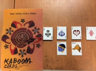
I am happy very happy with how our zodiac cards came out. They are very nice to look at, the colors came out pretty well even though i had my doubts. The black ink seems to stand out more than the rest of the colors. They are suprisely bigger than i thought they would have been, i dont know why i thought it would have been a bit more smaller. The size  makes it a bit harder to play with as a player card but on the flip side the illustrations looks really well and that was our main goal when designing these playing cards so our decision on making them a larger size was a pretty good idea. Even thought are larger the cards are still functional which is what i wanted.

The back of the cards looks really well also, the black really stands out. The paper quality is pretty good, it is exactly what i expected to be. However, I wanted the whites to pop more because it looks a little saturated for white maybe then the illustration would have pop out even more. We did had some issues with getting the file uploaded to the site and we had to ad and extra layer of white to the designs i dont know if thats the reason why the white is not as strong as i hope it would have been. But the slightly saturated white gives the cards a surprisingly cool look as well.

I am pleased with our card design we put a lot of effort into designing each card individually and the overall look of the project is uniform and came together really well. the overall suites looks uniform and the box that houses everything looks really well also. I was a bit skeptical as to how we would make so many designs different but yet the same especially since its more than one person design the illustrations but we pull it together really well. We came across a few problems such as how to make the designs uniform , also having sizing problem where our designs were being cut off because of the bleeds of the website , the website kept saying our images was low resolution, and we were having trouble uploading the files as well. However, as we went along we were able to solve our problems.

I was worried to about the colors and the specs being off or a bit different with our cards because we order two different sets of decks which we respectively designed, so we had to be really precise with our pecs. We all played our parts, however i wanted to design sometime extra to put in the box but we spent most of our time design the illustrations which were very time consuming. If i could change anything it would be the white color background of the card i think we could have added a texture seeing how the white is slightly saturated and it would have given the cards an even more unique look about it.