Month: March 2014

Homework For April 7

Homework for next week is to start articulating your final project. And you can probably imagine how we’re going to go about that….with a design brief. Please fill in the following fields, but note that some are a little different. Some fields that we’ve used before are not here. But the timeline has become much more specific. Make sure you spend some time mapping out the plan for successfully completing your project over the next 6 weeks.

Project Title:
Concept:

Aesthetic Summary:

Art:

Copy:

References & Inspiration (at least 3-5 sources):

Substrate:
Binding:
Additional Notes:

Timeline and Objectives:

For April 7:

For April 28:

For May 5:

For May 12: Present Digital Files for Final Projects

For May 19: Present Final Projects


Shenequa J homework March 31st

I like all the briefs that were presented in class last week. everyone had different formats and folds that worked for there topic. I enjoyed “This History of money” I’m not really interested in money design but their presentation made me interested. The way the design of money changed over the year is interesting. I love how they designed their design brief and made it the shape of the money, and it had the feel of it also. Another favorite was the “Weed” one. the subject isn’t something i’m interested in but the way it was designed and how their idea played out worked well. I like the idea of the little weed cards so you know what your getting. The suggestions that people made, made sense like putting the cards in bags so the smell doesn’t mix together. I think the cards should also have like facts or like the origin of the weed and not just the name and picture.

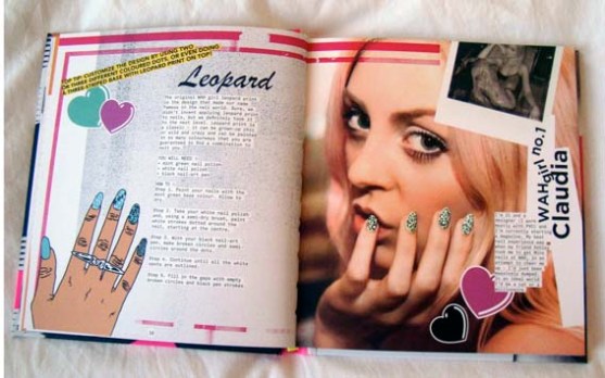
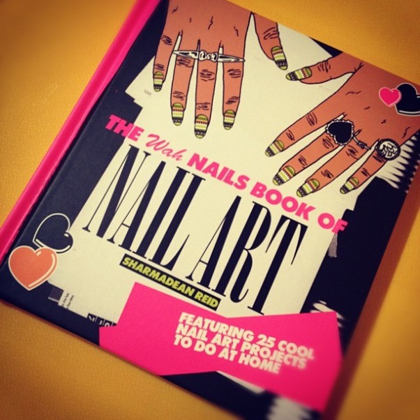
I’m really into nail art and like DIY kind of things so this book is great for me. This is a 96 page nail art book that you can get design ideas from. There is also a page of empty nail template so you can try your designs. I love the colors and how bright the book is, it has a lot of collage type of elements. The way it’s designed is very fun and urban, it’s like a party in a book. Very Wah like, it goes with the brand very well. I can see my self making a book like this it’s really my style. This book has a nice hard quality paper and a hard cover. The dimensions are 6.50 (w) x 7.20 (h) which is a good size for a book of this standard.ImageImage

Andrew Quintero HWK March 31st

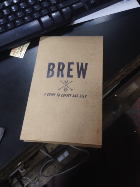
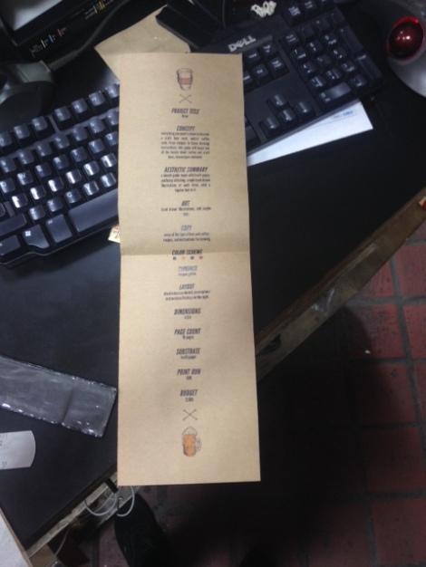
For project 2 the ideas were different in unique and amazing ways. The working process on BREW the project Stephanie and I worked on was a great experience and overall was satisfied with the execution. The communication was constant and we weren’t afraid to do something a little. Overall it was a fun and well experience group work. As for the other projects through out the presentation we saw multiple works that were amazing and well thought of. The first one for me in Money project, the execution was great and the use of color /material to match the dollar bill gave it an overall great feel and experience. I felt after seeing that presentation BREW could have included something extra to wow the audience, but i also feel we did the same idea for specific material because it provided everyone to have an idea on a cafe or bar experience.

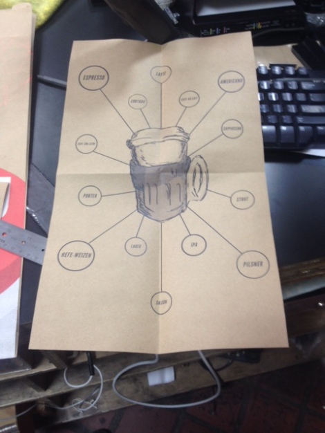
The second presentation was the cat vs dog info graphic brief. The coolest thing about this presentation was the presidential feeling of cats v dogs it gave off. The use of color was well chosen and the info graphics were easy to understand and read. Another unique approach was the opening of the brief, it was different like our choice to have BREW fold open and become a poster guide to drinks, we wanted the reader to enjoy the brief, which is what i think they went for as well. Give the readers some fun with information.

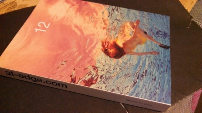
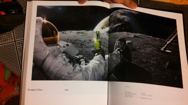
ImageImageThe images above is a publication that includes various works of photographers. The book is perfect bounded and has a semi gloss texture feel to each page to provide the photos high quality in my opinion. I look at this book and can view it as a great way to display works of art and also make a self portfolio display as well. I can image works of illustrations with name, small description and other information that may be provided. I love the overall feeling of the book and it also makes for great reference material. The book also plays well in using white space in each pages and give it a more opening feeling on the work of photography your viewing. The size is decent, but gives off a small magazine feeling made with better quality. The simplicity of the book is the main concept i love/enjoy the most.

Michael Tutko Hw for March 31st


I thought the Mid-Term presentation all when well, the class spent a lot more time discussing them than I thought. Every project was interesting as they were all different but, the tech magazine, the brewery, prohibition punch, and dollar bill all had something extra going for them. I also like how everyone’s “project” was different, not one team had the same set up as another. The brewery project was cool because of how it was stylize as a map/ info-graph, which was really awesome. And the prohibition punch was cool because it went further than just the publication, into more of a promotional kit.


One publication I find interesting is this mail in kit I used get when I was little. It was for this binder of dinosaur stuff, I mean what’s more hype than dinosaurs. Anyway It’s a binder with sheets of paper inserted into it and each “sheet” varies as a fold out booklet, small map, or 3 fold page. Therefore, the “book” isn’t just standard pages and keep it interesting to look at, beside the sick illustrations of dinosaurs. The pages have nice weight to them and are glossy, to help le the pictures stand out. It also has these cool cardboard like pages in the back that contain 3-D pictures which need be viewed with 3-D glasses.


Another book I find interesting is this little note book I bought at a staples one day while printing. I really like a book that’s big enough to use but small enough for my pocket. And although it’s just a notebook, I really like how it’s made. With this soft fabric cover, a strap to keep it closes, and a cloth bookmark attached to the spine. The pages I got are slightly discolored and have a smooth grain, but it definitely has some texture to it compared to standard computer paper.

DSC06165 DSC06166 DSC06167 DSC06168 DSC06169

Ian Pooran HW March 31

All the midterm presentations were really great and some stood out more than the others just because of common interest or great execution. The ones that really caught my eye were The different US Bills and the Brew guide .  Both topics are something everyone can definitely relate to and on top of that its everyone’s poison. The US notes were used in the design of the book and kept the color scheme which i thought was really unique from the other books and we all deal with money in one way or the other.

The History of the US Bills with the deign brief being the shape of what a normal bill was well thought out  .  The choice of paper even match their concept, which is a great way of connecting it. There was one idea that came to mind when I was talking to Andrew their design brief. When they presented their ideas it was informative also and they brought in real money that show the various US notes that were once in circulations .

I also liked The “brew ” concept and whats your poison i thought it was really creative and i really liked the texture of the design. I really liked how it was folded. Then there was the scratch and sniff cards concept with the marijuana plants. Their design brief was really well designed and very clean and minimalistic. However i kind of wanted to be more bigger, i wanted it to be a magazine or a health magazine with scientific facts like a science journal and maybe carry ads for different marijuana types. Also maybe the scratch and sniff cards can be a pull out page like they have for perfumes in those fashion magazines.

I found some really inspirational books in the bookstore and i even found an artist that i really admire. I always seen these pop art comic book paintings but i never knew who the artist was. The artist name is Roy Lichtenstein. I also found a book about some bloody murders that happened in NYC which was similar to one of my ideas that i had in a previous assign in our class, the murder book even had a warning label which mean i had to open it of course.  The book is a book of photography of some really violent crimes and some of them had exerts from the newspaper which was really intense. Another book caught my eye was a book of tshirts design.  It had some really cool and unique designs. I also saw a book That had New york and the nyc art scene.  it had all the different art galleries and some public art still on display now, it even had where the artist once lived or their art studio address.

photo 5 photo 4 photo 3 photo 2 photo 1


JOSE BENITEZ HW FOR MARCH 31ST

The midterm presentations were all great and some stood out more than the others just because of common interest or great execution. The two that really caught my eye were The History of US Bills and the Brew guide to coffee and beer.  Both topics are something everyone can definitely relate to and on top of that its everyone’s poison. Life would be nothing without getting that lovely green paper at the end of the week to have to go spend it on some great beer, but that’s besides the point.

I enjoyed the concept behind The History of US Bills with the deign brief being the shape of what a normal bill would be. Then even the choice of paper was thought through to match their concept, which is a great way of connecting it. There was one idea that came to mind when I was talking to Andrew their design brief. He had mentioned it reminded him of a bond and thats when I thought it should be wrapped around just like one of those bank documents to keep it enclosed to give it more of the feel like you’re dealing with money. The thing that put the icing on the cake for them was that they actually brought in the bills to shows us in person how they have changed over the years. Safiyyah was the perfect body guard, protecting Daniels money like that.

The Brew design brief nailed it. I always need a guide to what beer I’d like to get when going to a bar. I’m not a big fan of coffee so it doesn’t appeal to me, but it does to every New Yorker, its their crack and they must have their fix to get through the day. And I guess its somewhat the same when it comes to beer because its something that can help relax a person at the end of a long day of work. Anyways, its great how they thought outside the box with the unfolding of the brief instead of having it bounded with two staples to the back. It made it more interactive to have to unfold the brief and the poster on the back was visually pleasing. The paper making a connection to the product was great thinking.


Ray Luong HW MARCH 31

Many of the mid term projects were very interesting in their own ways. The part that i looked forward to the most was how everyone’s book was folded. Every project came in different folds, shapes and sizes. The way they designed the interior of their books were also interested because of the way they positioned it and their use of the space. The ideas themselves were great ideas in the first place. I really liked the way “Brew” was folded, i didn’t expect it to be folded like that. After seeing everyone’s projects, it really inspired me to think more outside of the box with the design of the book and the interior.

After presenting and taking questions and constructive criticism from my peers, i did want to change some things. Without the help of the questions, there wouldn’t be any better ideas coming along. One question was about the smell since all the cards are in one box. That helped me come to the conclusion of having them packaged instead of all in one box.

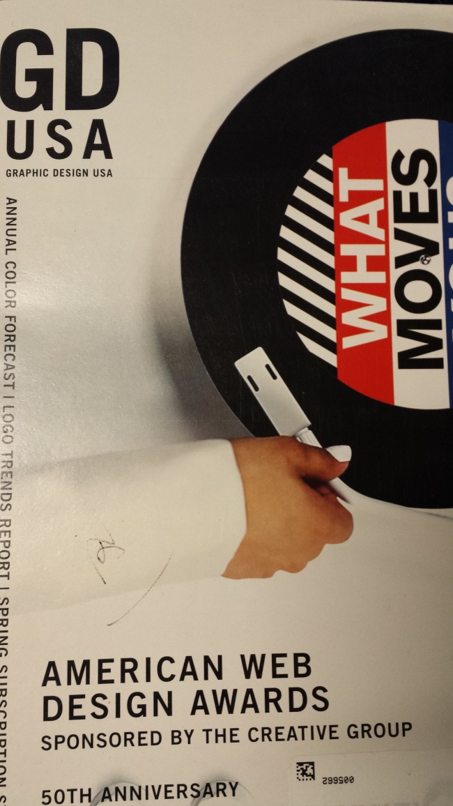
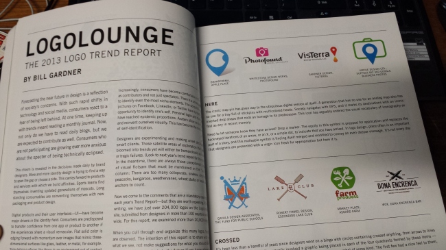
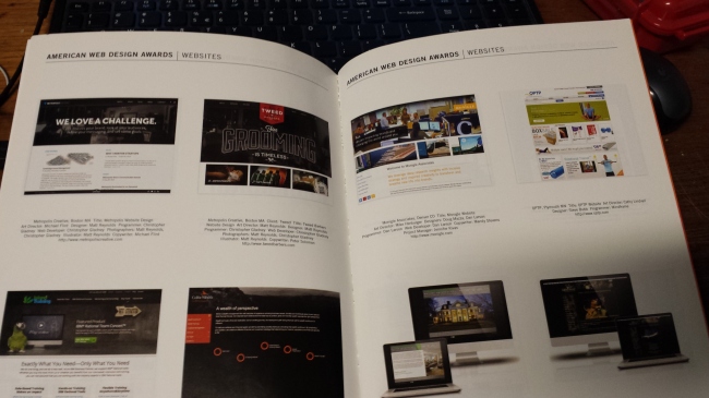
I chose GD USA. This free monthly magazine comes with a whole bunch of ads and design awards. Flipping through this magazine inspires me because there are so many designs and there are also paper samples to touch and feel as well. As a designer, i like to see all sorts of designs. Every month, the magazine usually features award winning design services such as packaging design, web design and more. There are also many ads for paper, and printing services as well. ImageImageImage

Wing Wat HW for March 31st

I really enjoy the presentation last class. All the projects are interesting and inspiring. And I like the cats vs dogs by Michael and Deny the most. Since I always find info-graphics to be an educational, entertaining, and useful tool and the topic they picked really grabs my interest. I also like the way they folding design, it’s clean and effective.

A book that recently inspires me a lot is called GeoGraphics, simple form graphics in Print and Motion. I have always been into geographic design and shapes creating minimal design. This book collects over 130 print works, products and site specific installations, showing how simple shapes can help to bind with its modularity and colors, connote complex brand visions.

The work are mainly built on geometry shapes and pattern. Mostly giving me an impression of the Swiss style and Bauhaus. Not only the work inside are awesome, the use of grid and layout of images are also very thought-through.

The book is a hard cover, perfect binding. Pages are likely 30lb matte paper.

photo 1            photo 5 photo 3 photo 2  photo 4